Here Are 10 Of The Most Interesting Data Visualizations Of 2014
By:
1. The cities that jack up their costs the most on New Years Eve...
According to Travel Mag, these are the top 10 cities to visit any other time of year (if you're cost conscious):

2. Americans will spend an average of $781 on holiday gifts this year
According to Gallup data nicely designed by Statista. The exception to the rule is the many millions of working Americans who can't even afford to buy the products they sell.

Are you in debt right now?
3. Speaking of spending money, it turns out your stage in life has an impact on where you think government should invest...
Any data set that groups tens-of-millions of people together is bound to be incorrect for a large sum of people. That said, this chart (designed by Randal Olson) does a nice job showing how priorities change with age.

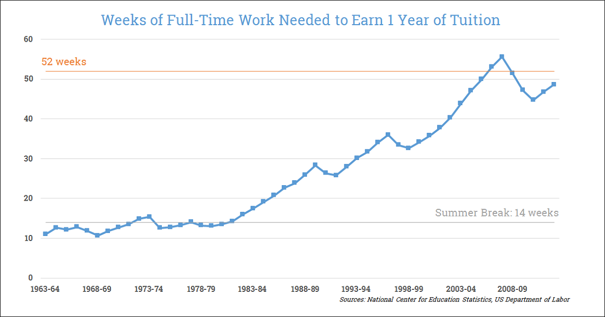
4. You could work a minimum wage summer job in 1978 and pay for a full year of college tuition. Meanwhile in 2014 a student would need to work a full-time, minimum wage job year round to cover a year of tuition.
No wonder the under 35 crowd thinks we should invest more in education! It turns out it's pretty much impossible to avoid college debt in the year 2014. I actually designed this chart 2 months ago.
5. Making matters worse, your textbooks are also more expensive than ever.
This one comes from The Economist, but Attn: looked into why textbooks are getting so expensive a few months ago in an interview with an expert.

6. It turns out you can use someone's family income to predict their SAT score
Trends like this one from MSNBC's All In With Chris Hayes, combined with the rising costs of education outlined in the visualizations above, are a large part of the reason it's incredibly difficult to rise out of the bottom income quintile -- or said more bluntly, it's getting harder and harder to achieve the 'American Dream'.

7. The word "Diet" hits its Google search low on Christmas -- a week later it hits its Google search high on January 2nd
You can see where the New Year's resolutions crumble thanks to this visualization, created by the New York Times.

8. Hacking is American's new biggest fear

9. The last 30 years have seen a spike in men pursuing computer science degrees, while the number of women in computer science remained flat and even started to fall.
As a result, the overall percentage of women in computer science has decreased dramatically, as shown and explored by NPR.

10. A majority of the US population now lives in states that allow same-sex marriage
Ending on some good news... This graphic from FiveThirtyEight points out that as of October 6th, 2014, more than half of the U.S. population live in states that have marriage equality. Since this chart was made less than 3 months ago, the number of states that allow same-sex couples to marry has jumped further, from 19 states and D.C. to 35 states and D.C. For the full list, head here.

Thanks also to Dadaviz and Reddit's Data is Beautiful for highlighting and creating these and similar visualizations.