This Ridiculous Graph Shows How Income Inequality Has Eaten Your Paycheck
By:
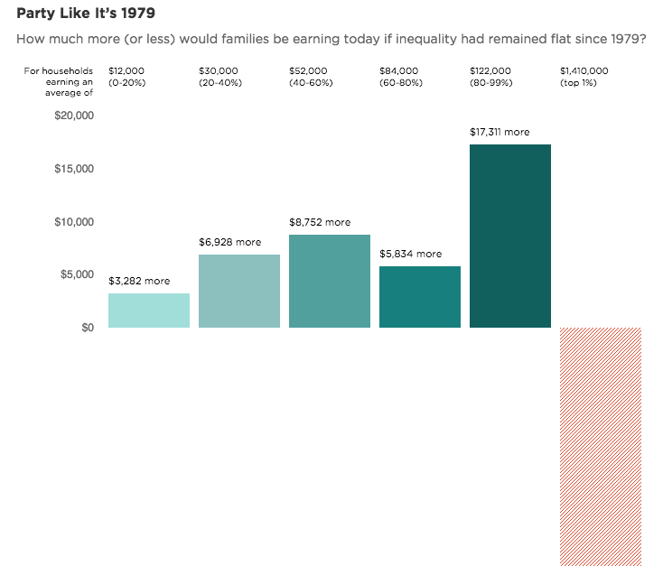
The folks over at Planet Money put together an incredible graph illustrating the extent of increased income inequality. Taking some data calculated by Larry Summers, economist and former Secretary of Treasury, the Planet Money team showed how much more you'd be making today if we had the same income distribution as 1979.
Here's a snapshot of what the found:

h/t Planet Money
The result, according to Planet Money, is that the top 1% -- households that average $1.4 million in yearly income -- would be making $824,844 less. (You can see the full red bar above if you click on the Planet Money link.) Meanwhile, households averaging $30,000 would have be making nearly $7,000 more per year.
Of course, as they point out, placing the 1979 framework on top of today's economy is not a perfect measure of income inequality. But this graph goes a long way toward telling the story of how much things have changed.
The most disconcerting aspect of income inequality is that it's getting worse. Although average income for U.S. families grew from 2010 to 2013, the growth was concentrated among the top earners. Three percent of the population accounted for 30.5 percent of all growth.

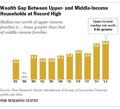
The median income of upper-income families in 2013 was $639,400 and almost seven times the median wealth of middle income families, according to the Federal Reserve. It's the widest gap ever recorded over the 30-year period the Federal Reserve has collected this data. Forty-six percent of Americans are considered middle income by Pew's research, while 21% are considered upper income.
For more on the reality of income inequality (and the idea that Americans are oblivious to just how stark it's gotten), watch this video:
